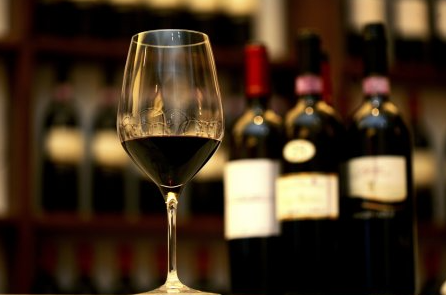
Some relevant industry surveys indicate that experiments done with consumers where they have to choose between bottles of red wine with only an image of the bottle have yielded results where up to 80% of consumers admit that their decision was based mainly on the wine label.
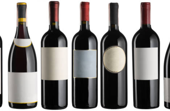
A wine label has very limited space, so all the elements to be captured must be chosen carefully. But also winemakers have completely different stories to tell, which makes each batch of wine from each vineyard unique and a well-designed wine label will make the wine stand out.
Wine bottle colors are standardized: reds are regularly sold in dark green bottles to avoid sunlight and prevent oxidation, while whites are sold in light or pale green bottles. The first step in choosing a color scheme for the label is to be sure of the type of bottle the wine will be sold in.
Reds traditionally follow two color schemes: deep, dark colors that create a very emotional feeling, or a white wine label with rich ink colors (deep reds, blues, or golds). White wine labels tend to go for light blues and greens, creating fresher sensations. And white, gold, and pink wines are the supreme kings of using super-modern, bright pink textures.
In recent decades, winemakers have started to get more playful with their color schemes, combining bright or dark labels with whites for a bold, contrasting effect, or choosing a full spectrum of bright colors to make red more playful.
TYPOGRAPHY
The font to choose for the wine label will tell the consumer a lot about the wine they will drink. Traditional wineries use more powerful, monarchical styles and typographic designs that evoke their history and authenticity. Tags are often based on serif or script-type fonts.
Modern wineries often use bold sans serif fonts for a contemporary touch. Other times they use larger fonts, with a lot of white space.
The most popular styles tend to fall into a couple of categories: elegant-bold-modern, and minimalist-classic-traditional depending on the personality of the wine, the brand, and its consumers.
STYLE OF THE IMAGES
Regardless of the style you choose, the wine label needs eye-catching images to attract attention. A traditional option could be an illustration of the vineyard where the grapes are grown. A minimalist design could show a small character or logo with a lot of white space around it. A contemporary label could avoid graphics altogether, using oversized typeface to grab the consumer’s attention. Some brave houses even choose to push the boundaries even further and use cartoons or very graphic and fun designs.
The images allow giving the bottle a unique touch. It is important to define what distinguishes them from other wines: is it the location? A feature of your heritage? A fun family trait? A cheesy name? It is imperative to find that detail and find a creative way to visualize it. Perhaps it could be based on a modern and clean tasting room that characterizes the vineyard where the brand is produced, this idea could be carried over as a message to the wine label design with lots of white space and an elegant sans-serif font to match.
BACK LABEL
The back of the label can include fun and interesting information about the wine, but it should also include some important facts.
In addition to including all the relevant information on the back label such as the history of the vineyard and the tasting notes, it is also important to include less-fun legal information such as the government warnings, as well as codes of bars if it will be marketed in supermarkets and supermarkets.
WINE LABEL MATERIALS AND PRODUCTION
In recent decades innovation in wine label materials has been exceptional with high-quality printing elements revolutionizing what were normally static and standard labels. A stroll down any grocery or specialty store wine aisle will offer examples of textured papers, decorative prints, raised lettering, and other signature touches.
More vineyards are taking the glamor of the embossing (stamping) stamping and punching. Embossing has long been used on sparkling wine and Champagne bottles as aluminum foil reflects light wonderfully, giving the label an attractive, high-end feel. The pattern is the process of pressing an image on a paper label, which makes the image (or image parts) are raised above the rest of the wine label. Although the print can be very subtle, it gives potential consumers a more tactile experience.
These items aren’t the only way to make sure your bottle stands out on the shelf – custom cut (or die-cut ) labels have grown in popularity in recent years. These are creative labels featuring custom cutouts and designs and offer an alternative to the classic rectangular wine label shape that we all come to expect.
Some of the effects that can be used are:
- Embossing or Embossing
- UV varnish
- Laminate
- Fold
- Hot stamping with Foil
- Invisible Security Printing
- Micro-text printing
- Variable Printing
- Foliated Printing
- Hologram for Authenticity
BRAND CONSISTENCY
In almost all stores the wine is organized on the shelves by grape or by style. Even within the country of origin, red and white wines are kept in completely different areas. How to ensure that consumers find the brand in each section of the store? It is essential to create continuity in the brand in all products, to ensure that the bottles are united throughout the store.
This is especially important if the labels change slightly in color according to their variety. A strong and distinctive brand is extremely important: once a customer tastes and likes a style of wine, they will be excited to see your logo in a wider range of options and will be more likely to try another variety.